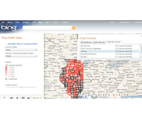
Bing Maps is now helping you find the healthiest cities in the U.S. with a new app, Bing Health Maps. Microsoft is mashing up data from the Department of Health and Human Services to visualize what parts of the country are healthy or not so healthy by state and county.
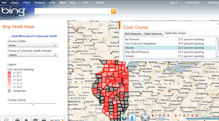
You can select a state and a Community Health Indicator, which includes Birth Indicators (low birth weight, premature births, births to women under 18); Death Measures (homicide, lung cancer, stroke) or Health Risk Factors (obesity, smokers, high blood pressure). You can also see what percentage of the population of a given county are reporting the answers to the questions to give you an accurate view of the statistics.
The data visualization of the app is really compelling if accurate. For example, in Cook County, IL, you’ll find that 22 percent of the population is reporting obesity as a health issues, that 13.3 percent of births in the county are premature, and that there is an average of 28.1 cases of breast cancer per 100,000 people.
The map will include all the counties within a state and your can click on each country to get information for a specific community. It’s similar in theory to Google’s Flu Maps feature, which maps flu levels across 121 cities in the U.S.