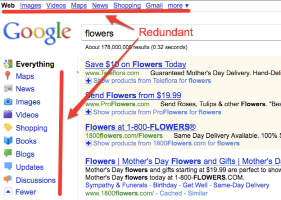
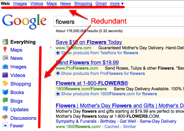
For a company obsessed with removing every spare word from its homepage (“The fewer, the better,” Marissa Mayer once noted), Google’s new search interface seems a bit weighty. If you haven’t noticed by now, yesterday Google launched a redesign which prominently features ways to refine your search on the left-hand side. Now you can search for “Everything” or narrow your search to just news, images, videos, maps, shopping, books, blogs, updates, or discussions.

Sure, Google is borrowing a page from Bing, which centers its entire experience around guided search. That’s okay, Bing copied Google’s universal search box. Competition pushes products forward, and it’s all good.
But what is up with the redundant UI? Nearly all of those options are still also available along the top of the page, where they have always been (including the drop-down “more” menu). Time to get rid of them. Putting the guided search on the side is much better. It lets you toggle between different types of searches for the same keyword and it no longer feels like you are going off to some strange corner of Google like Google Book Search.
Those links across the top add nothing to the page. If fewer words are better, then why is Google cluttering up its search page with unnecessary repetitions? Sure, people are used to finding those options there, and maybe Google just wants to ease them into using the new side navigation before pulling away the familiar ones up top. Sometimes, you’ve got to pull off the band-aid, . . . Marissa.
,