
As you may be aware, tomorrow, Facebook kicks off its big f8 developer conference in San Francisco. We’ll be there to cover what’s going on, but it looks like a lot of the information is already out there — Inside Facebook, All Facebook, and GigaOM have good write-ups of what we can likely expect. We’ve previously reported on a bunch of these possible announcements such as the Meebo Bar-clone, the “Like” button for the Internet, and auto-logins for Facebook Connect.
Obviously, I’m interested in any location announcements the company may make tomorrow — but it’s not clear if Facebook will actually announce anything yet as their plans have been fluid, and possibly still aren’t solidified. I’m also pretty interested in the Open Graph stuff Facebook plans to talk about. When this was first vaguely previewed back in October, Facebook’s intention seemed pretty clear to me at the time: to make the entire web its tributary system. It’s likely to either be huge — or another huge privacy disaster for the network.
These grandiose plans are great and all, but as I sit here the night before f8, I find myself wondering something very simple: why does using Facebook frustrate the hell out of me?
As I noted earlier in my farewell to Facebook Lite, I think it’s just because I find the service too cluttered, and confusing. The various options menus are a nightmare. All the privacy settings are beyond confusing. And while the overall site navigation has improved greatly over the past year (goodbye weird bottom nav bar), I still find myself lost quite often.
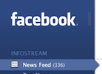
And then I see something like this. From 2006 to 2007, the design group, iA, was in touch with Facebook about doing a redesign. Facebook didn’t end up using their stuff, but iA recently decided to take what they had done and update it to work with the way Facebook is currently laid out. The results are excellent — much better than the way Facebook actually currently looks.
Look at these mock-ups, but be sure to go to their site to see them in full resolution, to see how they would actually look in full size.

Sure, it’s a bit Outlook-inspired, but wow do I wish I could navigate Facebook this way. The stream? Nice and clean, most elements are the same size (like Twitter) because comments are shoved into a new column on the right (and collapsed to show only 2 by default). And that comment column looks much, much better because it’s not surrounded by those ugly blue square backgrounds that currently make a complete mess of the stream. And there are in-line replies.
Ads are still there, they’re just in this third column. The search box has been moved from that odd no-mans-land middle off-center to the left column. And the nav makes it very clear which stream you’re currently viewing.
As iA notes:
Our basic idea: To create an mail-application like interface with an elastic three-column layout that clearly separates filter, information-stream, and reaction:
Filter: The left side column works as a sorting instrument
Information-Stream: The center column shows the filtered results
Reaction: The right side column is used for discussing the individual feed items.
It just seems to make sense. More importantly, when you look at it, it seems to make sense.

Sure, it’s hard to argue with 400 million users — and most would undoubtedly hate such a massive change. But Facebook, perhaps more than any other web company, is good at knowing when to when to ignore user complaints and push forward, to improve the product.
I think they should take another look at iA’s work. Or at the very least, use the ideas of those FriendFeed guys more.
Also, where the hell is Facebook’s iPad app?