
Update: Yahoo delayed the release of its the new Web interface. It isn’t clear when it will come online, so please be patient. Update 2: The Web site is now live.
Today Yahoo refreshed the iOS application and website of its Finance service. The updates are worthy, and will help Yahoo remain relevant in the financial space, and perhaps support the continued growth of its mobile userbase.
If you think that the 5 year forward PE of a company can be a one word joke, you probably use Yahoo Finance. As far as online financial sites go, it’s among the best and most used. Yahoo’s update to Finance’s Web interface and companion application is therefore a decent way to grok the company’s design vision, and vet its improving mobile chops.
Briefly, the new Web interface of Finance has been dramatically cleaned up, and set up to allow users to more quickly track their personal portfolio, and drill into market movement across asset categories.
Here is a screenshot I took this evening of the now prior Yahoo finance page:
Not the prettiest thing. Yahoo Finance was never prized for its beauty, or layout. I personally use it because of its informational density.
In the age of flat design and simpler color schemes (iOS 7 aside) Yahoo has now attached itself to market trend of simple design. At least in this product refresh. Its other properties – try to figure out what is going on here – remain aimed at other demographics.
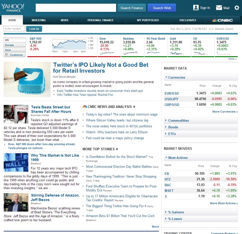
Now, to the new design. The following image is a Yahoo-provided screenshot, as I did not have access to the new website post-meeting:
![Finance_Home_Following[1]](https://techcrunch.com/wp-content/uploads/2013/11/finance_home_following1.png)
This is a distinct improvement. It would have been far better to have screenshots of the same moment in time of the site to compare the versions, but this is the best I can do.
The most important change that Yahoo has implemented both in the new Web interface and the updated iOS applications is personalized content. As you can see in the upper left of the new design, stocks that you are following are displayed. You can select and remove stocks from that list. The content in the middle tracks your interests, which is useful.
If you look at the upper right corner of the new design, you’ll see a simple, visual explanation of the strongest and worst of your personal portfolio performers. This fits into Yahoo’s larger goal of creating Internet-based experiences that help you with your repeated tasks. You care about your money, so you check its performance. So to help you quickly eyeball the dollar flux, Yahoo has built the new widget.
The site’s other pages have been updated as well. What you need to know is that it is now easier to track your own investments, along with commodities, currencies, and markets than it was before on the site.
On a personal note, I spend a decent amount of time tracking upcoming earnings from bellwether companies, and market expectations thereof. Yahoo has put together a new tool that tracks both pieces of information for you. Yes.
The desktop Web, however, isn’t Yahoo’s new direction, so we need to rummage up a smartphone and go mobile.
On The Go
Yahoo currently has 390 million monthly active mobile users. That’s a number that it has managed to sequentially increase. Given the relative short time in which Yahoo has lived as a mobile-first company, or at least a company first about becoming a mobile-first company, it has performed impressively.
While revenue questions persist, the company’s strategy to grow its mobile userbase is working. That in mind, the update to its Finance applications is component to a larger strategy. I’ve been critical of Yahoo before for failing to end its revenue malaise through expanding mobile usage, but must admit in this case that financial quibbles aside, I like the new iOS experience it has built.
Android and Windows Phone users need not apply – Yahoo, like many smaller technology companies in Silicon Valley is a touch Apple-centric, at least when its Finance products are concerned. It’s not by accident, I don’t think, that its new desktop Web Finance site is likely far easier to touch than its predecessor. Hello, tablets.
What’s new for Finance on iOS? Similar personalization to what we saw in the Web refresh, the same market information, the same data across asset classes, push notifications for information that fits your financial interest, and the best charts I’ve ever seen on a phone. Here are a few shots taken from my personal cell:
[gallery ids="910805,910800,910801,910802,910804,910803"]
I used the app today and found it responsive, and attractive. And for the first time in memory I have a Yahoo mobile application installed on my phone. It may be a first, actually.
—
Taken together, Yahoo has managed a strong, and functional refresh of the Web interface of its Finance service, and refresh its iOS experience in a way that easily bests its previous versions. If you can’t live without an IV of market data, each is worth taking for a spin.
Top Image Credit: Flickr