Google has been working for some time to improve how it highlights mobile apps, and the data they contain, in its search results. And now, Android users performing Google searches for apps outside the Play Store will notice a big change in how apps are being presented in search results.
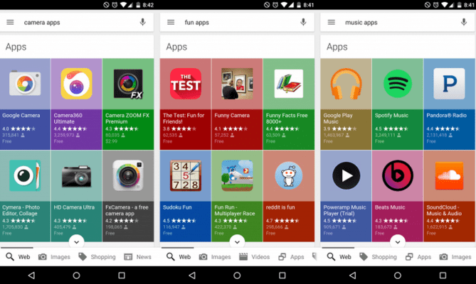
Where before, apps were listed one-by-one with each app on its own line followed by a link to see “more” apps of the same kind, the new search results interface instead displays the recommended apps in a colorful, grid-like pattern that’s reminiscent of an app store’s look-and-feel.
The updated design was recently spotted in the wild by a number of individual users and blogs, including Android Police and Search Engine Land, for example, though no formal announcement about the change has been made on Google’s part.
The change, which seems to be partly influenced by Google’s new design language known as Material Design, really pulls the eye to the app listings with the bright colors used as the background for each app’s tile. (It appears that the background is being matched to colors within the app’s icon, perhaps algorithmically.)
But it does so at the expense of the information that previous app search results offered. Before, app results had room to offer a brief description of the app at hand, the new tiled grid is limited to showing title, rating (and how many people have reviewed it), along with the price. To learn more, you now have to click on the app which directs you to the Google Play Store.
In addition, having the apps arranged on a grid so close to each other makes it easier to see the unfortunate and often uneven design choices for icon styles across the Play Store. Unlike in Apple’s iTunes, where specific guidelines are upheld for things like icon size and shape, some of the Android app icons will be larger squares, some are squares with rounded edges, some are round, some are just different shapes altogether (like pictures of cameras or folder icons), and so on.
You can see the new app search results for yourself by searching for nearly any term followed by the word “apps” on Google from your Android device. Not everyone has reported seeing the updated search results yet, which could indicate that Google is still rolling out the new look to its user base. (We’ve asked Google to clarify).
Google has made a number of changes in recent months to better integrate mobile applications into Google Search results, as its business becomes increasingly mobile. For example, in April, the search results on Android were updated with prompts to install apps that featured content relevant to a user’s search query.
That way, if you were searching for a particular recipe, Google might link you to an app that offered a recipe that matched your search term. Thanks to app indexing, it could also link you directly to the page within the app where the recipe was located, after you downloaded and opened the app for the first time.
The company later rolled out a similar feature for iOS apps in May.
However, Google searches today on iOS still show the old line-by-line listing when showcasing app results instead of the new, colorful grid.
[gallery ids="1202266,1202267"]
(Image/video credit: Android Police)