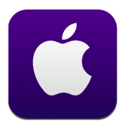
Apple’s dedicated app for its Worldwide Developers Conference arrived today, and it offers a look at some of the sessions happening during the event next week, but it also shows off a dramatically different UI compared to past iterations of the app. The changes sound a lot like what’s said to be on tap for a visual refresh in iOS 7. It also might be a good early indication of what Apple will be bringing not only to its own apps, but also what it will expect from those from the developer community, as well.
9to5Mac’s Mark Gurman retweteeted the tweet below, which shows pretty clearly the evolution of the WWDC app over the past few years, spanning 2011 to 2013. As you can see, there’s a fairly different design language at play. What started out with textures meant to mimic 3D effects, more use of contrasting colors and shaded buttons, has now become a much flatter design. The changes are mostly subtle, but from what we’ve heard recently, that’s what’s in store for iOS 7, too; sweeping, system-wide changes, but ones that tweak the interfaces rather than overhaul them completely.
https://twitter.com/markgurman/status/341576169608585216
Even the icon itself is much simpler and cleaner than most of the ones Apple puts out for its own mobile software. But both the icon and in-app elements still retain a slight gradient, which is not technically representative of perfectly “flat” design. Still, it’s a definite toning down of what we’ve seen before. Viewing the WWDC app itself as emblematic of the overall changes the company is planning for its mobile OS might be reaching, but at the very least it’s probably a cue of where Apple might be headed with changes to stock elements across the OS.
That means a new look for app developers trying to achieve a “native” look on the platform, which could actually result in a lot of work for some to bring their apps up to spec. Lately, it seems like a lot of app developers have deviated from strictly copying Apple’s iOS design principles, however, and offered their own take, which seems to involve more and more flattening of visual components. But even slight changes can result in big headaches for designers trying to achieve a certain effect. Still, the changes overall look like improvements to me, so hopefully more third-party apps follow suit with this subtle but refreshing new look.
